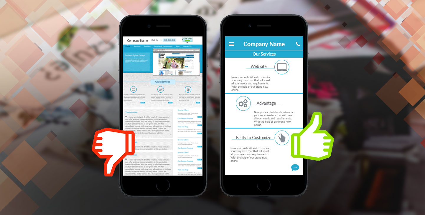
Users spend a considerable amount of time with their phone or mobile (US adults spend 5 hours per day). However, being on mobile they are quite agile, and getting their attention is a no mean task, as a whole world of data is at their fingertips (the average attention span hovers around 4 to 5 seconds). So the challenge is big. To help you contain it, and thrive in the competitive marketplace, here is a 15-point action plan based on the feedback from UI-UX designers, web developers and software quality analysts at Root Info Solutions.
1. Avoid Unfriendly Menus
The Menus is an important point of attention. Not only, you need to make it responsive, rather mobile responsive, thereby allowing users to have a clear idea of what to expect from the navigational structure or the website. Remember, unlike the desktop, on mobile, you don?t get sufficient space to apply breadcrumbs, so the menus have a bigger role in keeping users informed and engaged. Using arrows (>, <) or (+, -) symbols is a good concept. Keep menus short and use simple and concise terms. Its positioning should be done accurately keeping in mind the user experience across different devices.
2. Avoid Using a Different Domain
Keeping a separate domain like .mobi (dotMobi) is an obsolete idea that no longer makes any difference either to the search results or the user experience. Rather than, retain the domain -- .com, .org, or whatever -- of the website. Though some site owners use a mobile content subdomain like ?m.yoursite.com? or a subdirectory like ?yoursite.com/m,? it?s no longer an obligation.
So what?s the takeaway? Don?t waste money buying a separate domain and then deploying your resources to put extra effort in designing and coding to make a mobile-friendly website. So target both mobile and non-mobile platforms with just one website. Have queries or concerns? Or just want to get your project done by some sensible people? Reach out to us.
3. Avoid Changing Key Elements of Your Website
Maintain visual and structural consistency on desktop and mobile and everything in between as users might need to toggle between the devices as per their convenience. Retain the primary navigation structure, colors and imagery that you have on your conventional website. This helps users to discover information they want the device of their choice effortlessly. And, better the user experience is, the better goes the conversion.
4. Avoid Content That Spoils the User Experience
Content that needs a colossal amount of coding should be avoided in the mobile version. Some elements like JavaScript and AJAX fail to work well with mobile browsers, so it?s better to skip them. Likewise, Flash adds to the visuals of the website, but at the same time, it adds to the loading time of the website. So there is no point in elevating the visuals at the cost of loading time as that will only frustrate users and results into increased bounce rate owing to the poor user experience. Besides, this is also detrimental to SEO (search engine optimization) prospects.
5. Don?t Clutter Your Website with Too Much Content
Squeezing too much content or information on a single page downplays the engagement and user experience. Stick to a single or to an extent, to a double-column strategy. Don?t exceed anything horizontally that asks users to scroll left or right on the device. Concise and discerning content using powerful words is a simple formula to connect with users, provided the basic guidelines of UX design --- Minimalism, Typography and Color Scheme -- are taken care of. This adds to the beauty of the content maximizing the probability of the conversion.
6. Don?t Skip Site Search Function
Include an efficient and agile site search function so that website visitors have a quick access to your content. A properly working search tool can also control the damage resulting out of a poor navigation. Incorporate it anywhere so that it doesn?t cause any distraction to the user experience.
7. Say No to Broken Images
Make sure the images that you use are compatible with different devices that your target audience might use. Without taking the test, you might end up with a website where some images get stacked, resized or failed to load. Broken images discourage users to continue their journey. Ask your quality assessment team to check the functioning of the website across different devices and browsers.
Related Topic: Responsive Web Design and Development
8. Avoid Confusing Call to Action
Value the time of your audience. Once you have involved them in your conversation, it?s time to make them take actions you want. So to provide a clear call to action feature, probably, after 4 to 5 scrolls down the page. However, don?t get the CTA mixed with the body content. Keep it discrete using the right color contrast and adhere to the minimalistic design principle.
If users are filling a form or subscribing your newsletter, blog or case study, make sure they are informed. Acknowledge their action with an appropriate pop-up message, like Thanks, Thank You or We?ll get back to You or something similar that fits the scenario.
9. Don?t End up with a Broken Form
Everybody hates filling a form, but being a website owner, you can?t escape implementing it. However, you can make that experience less boring and less complicated. Reducing the number of fields is something that you can control on your own. Besides, you need to keep your form working well across different devices and browsers by properly using the JavaScript elements. Test, test, and test. Fix, fix and fix one and all bugs that come across because practice makes a person perfect.
10. Don?t Underestimate Mobile-Friendly Features
When users are on your website, be the ultimate guide to them. Hold their hand and make them walk through your territory enabling them to find what they need. Information like contact number, maps, and directions, hours of operations, holidays, etc. should be easily visible on the front. Coupons and discounts can add icing on the cake. Integration of contact number and maps should be done appropriately so that they work well with the phone or GPS of the device. Let users have an app like experience with your mobile website.
11. Don?t Disconnect Desktop and Mobile Strategies
Let users have a control over what they see and how they want to see it. Provide a quick connectivity between the traditional formatting and mobile formatting. Maintain this synergy across all pages displaying a link that allows users to choose toggle between desktop and mobile version. Think of leveraging the popularity of offline channels like TV, radio, or in-store advertising to let people know about your mobile presence.
12. Don?t Turn a Deaf Ear to AMP (Accelerated Mobile Page)
Google is a major search engine and you must not ignore its suggestions if you really want your website work well. AMP is a key project that Google has administered to drive user experience on mobile platform search results. Websites adhering AMP get loaded faster, are highly engaging and agile and, therefore, are valued more in Google search results. Ultimately, such a website reduces your digital marketing effort and budget and maximizes leads and conversions.
Considering the dominant position of mobile and Google both, it?s hard to ignore AMP. Is your website compliant with AMP? If not, take a call now. We can help you with. We keep our staff abreast of the emerging technologies. Check Briggs Freeman website that we built for a realtor based in the US. The website loads in 1.72 seconds despite being loaded with high-resolution images.
13. Don?t Underestimate the Power of Social Media
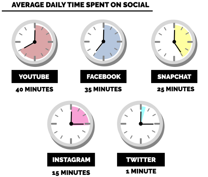
People are obsessed with social media, irrespective of the age-groups or demographics. Here is to what extent.

Hence, make sure your website links to your key social pages like FB, Twitter, LinkedIn, Instagram, etc. Social connectivity ropes in dual benefits. First, your news, updates or offerings reach to them instantly. And, second, their social actions (likes, shares, etc.) or word-of-mouth make further customer acquisition easier. If you have an app too for your business, social is an incredible platform to increase its downloads and usage.
?Social? is what people do on their phones! Include promotions and links to your mobile website from your Facebook page and status updates. Link to mobile versions of your pages on Twitter and Tweet promotion codes and SMS contests. Incorporate your website into the social media pages like Facebook. This also gives you an alternative to adding QR codes to your app.
14. Don?t Forget Integrating Mobile Strategy with Email Strategy
Complement the customer acquisition strategy driven by your mobile website with an optimized email strategy. Make sure that your sales and marketing emails not just reach out to your target audience but also generate the desired impact and conversion. Recipients should not face any challenges regarding accessibility. After all, you have to monetize your technology investment. Isn?t it?
15. Don?t Ignore 404 Error
This is the most disgusting problem that might compel your prospects or customers to take refuge under the umbrella of your competitors. This problem is quite common as developers often miss to keep a synergy between the URLS targeting desktop and mobile. To avoid damage to customer engagement and conversion owing to 404 error, redirect the desktop URL to relevant mobile specific URL.
Users spend a considerable amount of time with their phone or mobile (US adults spend 5 hours per day). However, being on mobile they are quite agile, and getting their attention is a no mean task, as a whole world of data is at their fingertips (the average attention span hovers around 4 to 5 seconds). So the challenge is big. To help you contain it, and thrive in the competitive marketplace, here is a 20-point action plan based on the feedback from UI-UX designers, web developers and software quality analysts at Root Info Solutions.
If you are you looking for a responsive website design service provider.


