Mobile User Experience (UX) is not just critical to retailers in the eCommerce space but also to your non profit organization. In absence of an impressive UX, your app is likely to get cornered by 75.4 million of donors, the millennials.
And It?s Serious Because Unlike Baby Boomers, Millennials Hate Poor UX
The millennials are the largest cohort of the population in the US and, interestingly, they are the largest cohort of donors as well. But they are highly impatient and intolerant towards inefficiency. Brad Szollose, the author of Liquid Leadership and an expert on millennials say ?while baby boomers were tolerant of waste, millennials hate waste and inefficiency with a passion?.
It was said in the context of the organizational inefficiency that is a major cause of the failure of half of the nonprofits that are set up every year. Since fundraising is an integral component, you must pay attention to it leaving no loopholes in your fundraising software that could deter serious donors.
Cheat Sheet to Help You Avoid UX Mistakes in Non-Profit Fundraising Apps
1. Forcing Users to Register Before They Know Your Objectives
Imagine you had to buy a souvenir item while you were on a trip. But on the entry gate, you were asked to enter your name, contact details, etc. So what you did? Wasn?t it disgusting simply?
Certainly, nobody would feel good about this sort of engagement approach, and feel uncomfortable with and, chances are, he or she will leave the shop without any purchase.
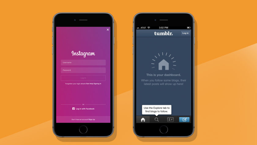
A new user to your fund raising app feels the same discomfort, if the app asks them to sign up or register, in the very first attempt. So don?t be in haste. Allow users to know about your organization, what you do, and why you do. And, most importantly, why should they stand by the cause.

Remember, sign-up or registration is just to ensure that your information is being accessed by authorized users. So there is no point of compelling the users who haven?t stored anything so far. Doing so will only make them impatience.
You will like reading this: How to Create the Best Fundraising App for my Nonprofit
Albeit, there is no harm in making this a part of your app at a later stage when they want to become a member or volunteer, or donor.
2. Overloading the Fundraising App with Too Many Features
Remember, you are not in a competition to showcase your creativity, rather to persuade donors out there, so don?t ask your app development company to overburden your fundraising app with too many features. This will only confuse the audiences and erode the conversion prospects. In addition, it will raise the app development budget.
All, that is required through the app is to establish a healthy communication in a clear and concise manner. The small display factor must be taken into account. Your app should not jumble information in a heap. Remember, with your communication, you have to make the audience feel what bothers you, and entice them taking immediate desired action.
3. Allowing Out-of-the-Box to Play the Spoil Game
Out-of-the-box thinking. Echoes a positive sentiment, but what if it doesn?t get digested by the audience the app is targeted at. So the user experience innovation shouldn?t be a burden on the UX designers. Let them keep the navigation and gesture control as simple and intuitive as possible.
Remember, UX is a road that takes donors to the goals that you have set for them. So it should have milestones and signages, that is well understood by the traveller or the donor, otherwise, they are most likely to quit the path. A healthy UX can convert them from a casual information seeker to a serious donor or subscriber.
4. Adding Long up-front Tutorials
Completing homework on time is a good habit. Being attentive to what teachers say is a good manner, and so on. We were educated, and we educate the same to our offspring. But, unless the self-consciousness is born, the situation doesn?t change much.
So, the crux is, we learn better from our mistakes than from what we are taught. And your app users are no more different. Users are more interested in exploring your app themselves, so there is little need to put any swipe-through tutorial. Don?t make it an essential component of your app, unless it?s truly essential.
5.Annoying Users with Push Notifications
The most disappointing thing in an app-life cycle is its uninstallation by users and, disappointingly notification is one of the important reasons that provoke people to uninstall a mobile app. Almost, over 70% users uninstall the app being puzzled with irrelevant or annoying notifications.
Avoid sending notifications too frequently, and at times when they don?t like to read or engage with. You might end up losing your valuable volunteers or donors.
Takeaways
So, it?s loud and clear that adopting the minimalist approach in mobile app design and development is the need of the hour. Informed users love to explore the app with trial and error, but they appreciate apps that make them do things with ease and perfection.


